Icon Style Guide and Strategy
Leading a design strategy of this magnitude was an incredible and humbling experience. Seeing icons in the world has a very different personal critique. I truly understand how critical icons are to the world of various user experiences.

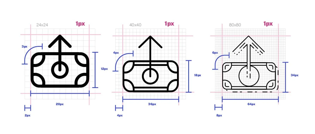
Sizing, Line Weight and Endcaps
Getting a strong foundation for this kind of strategy requires consistency and attention to detail. Keeping the most standard variables clearly laid out reduces the fatigue of unlimited icon iterations.
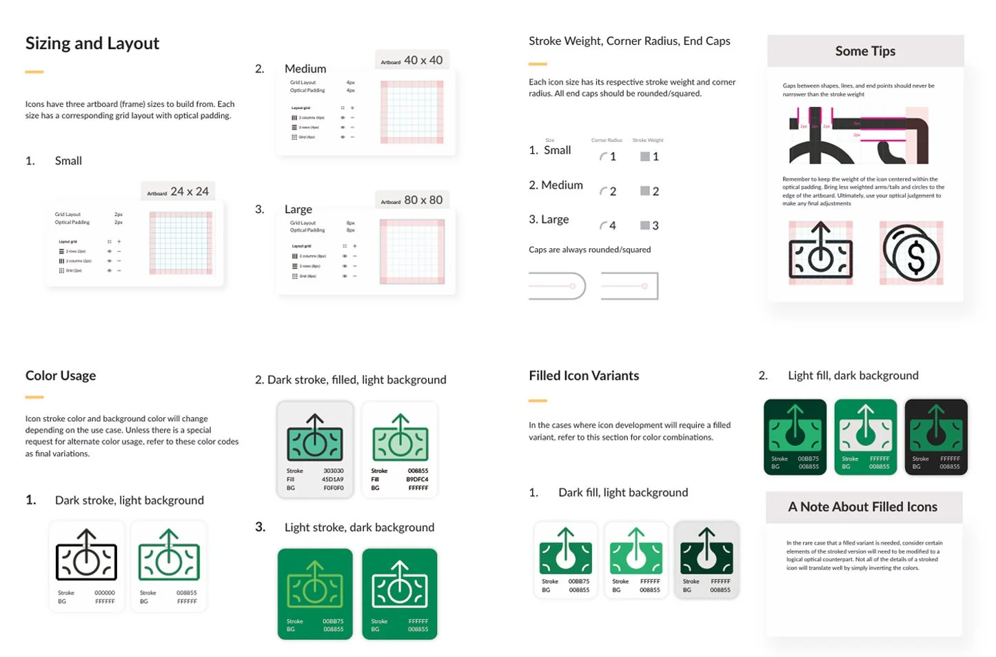
Filled Variants
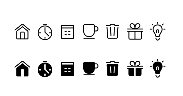
The many use cases of icons can be hard to catoregize for all future instances. For navigation icons, it’s important to keep the styling outlined with filled versions available if needed for selected and unselected states.
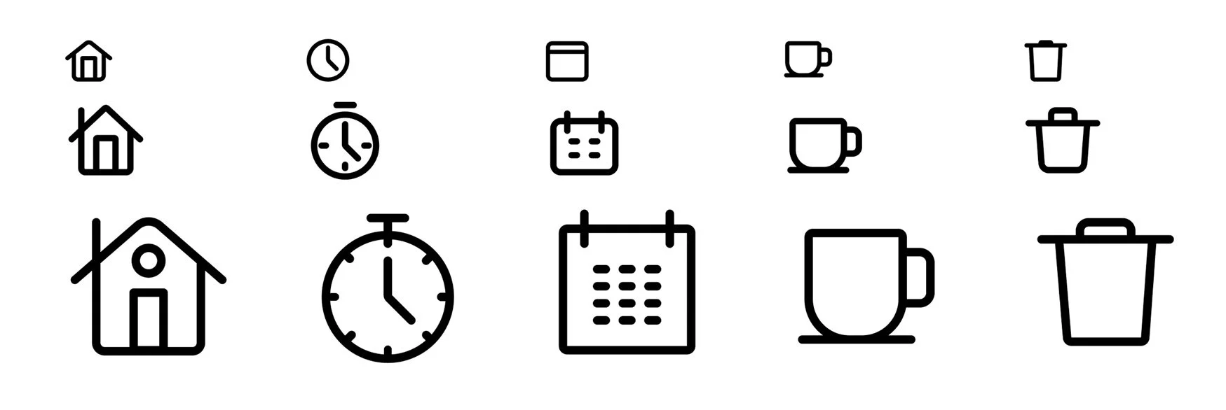
Knowing how to properly scale an icon so that it will look consistent within the icon family is another key to success.
Auto Layout and Variants
Using the most up-to-date Figma techniques creates an even more structured icon strategy that only gets better over time

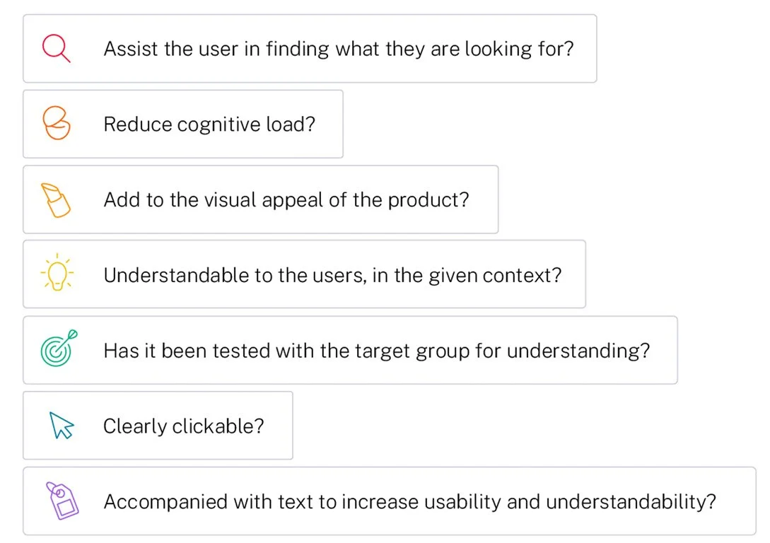
Best use cases
Understanding how and when to use iconography in a given user flow is just as important as what the icons look like. Icons need to work together in certain spaces to assist hiearchy of information and create the best possible experience.


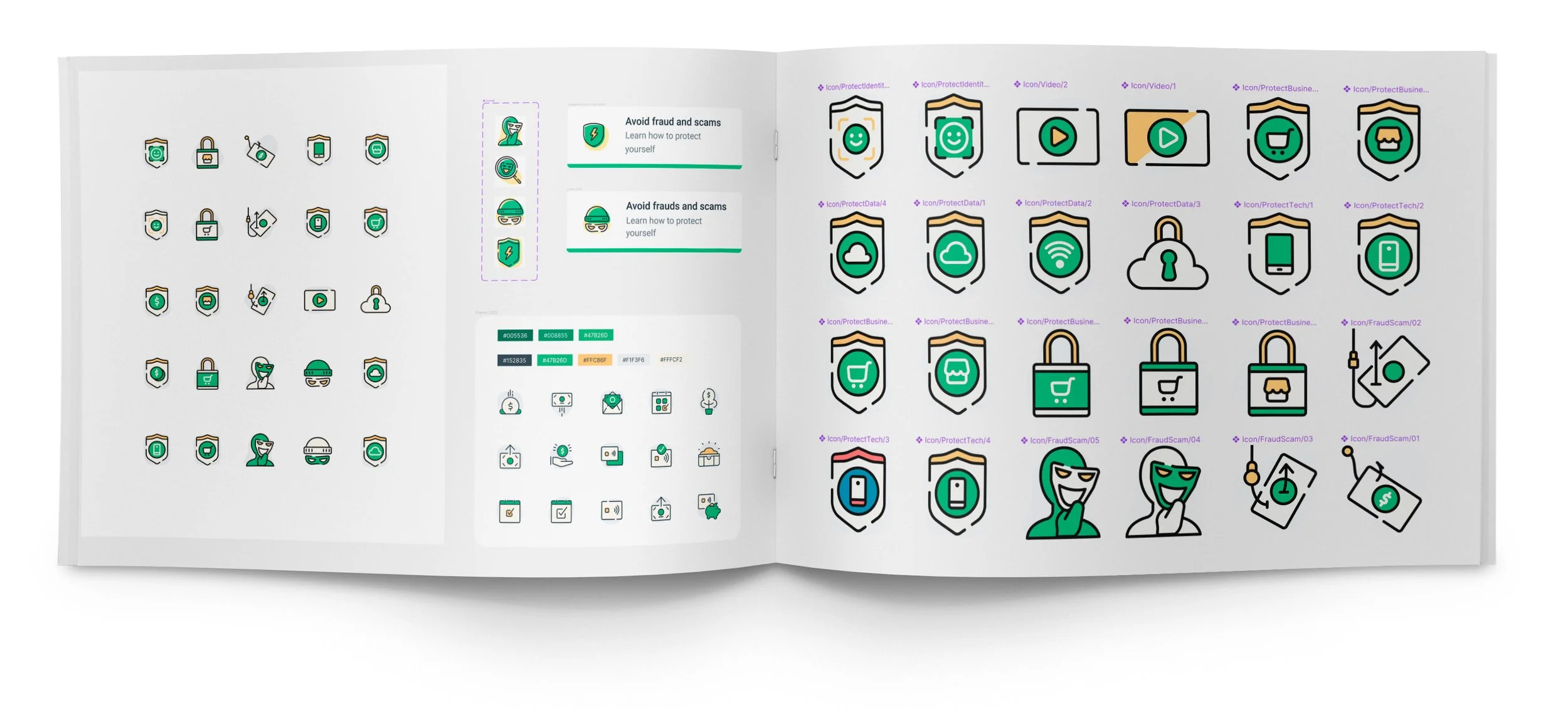
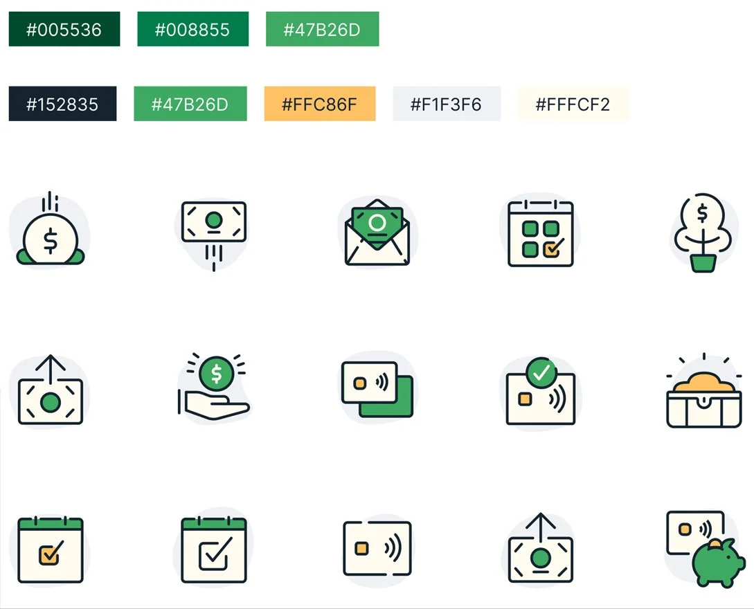
Final Icon Styling
Every part of the process to get to the final set of guiding icons with a color set that worked with the brand and the design system currently in place was such an achievement. Couldn’t be more proud of a personal professional project.